Penn State Health News

Click the image to open the site in a new window
Link: https://pennstatehealthnews.org
Opportunity: Undergoing a brand refresh, Penn State Health’s newsroom needed a new look that aligned with its new branding and helped to focus on the content better than the previous design.
Process: Working with existing colors and logowork can be a blessing or a curse. If you have well-thought-out branding, it can provide a solid foundation and structure in which you can build cool new things. Penn State’s new branding gave us that, providing us with a color palette and the logowork that they wanted to feature across properties and platforms, while allowing enough flexibility to allow us to provide all the necessary functionality.
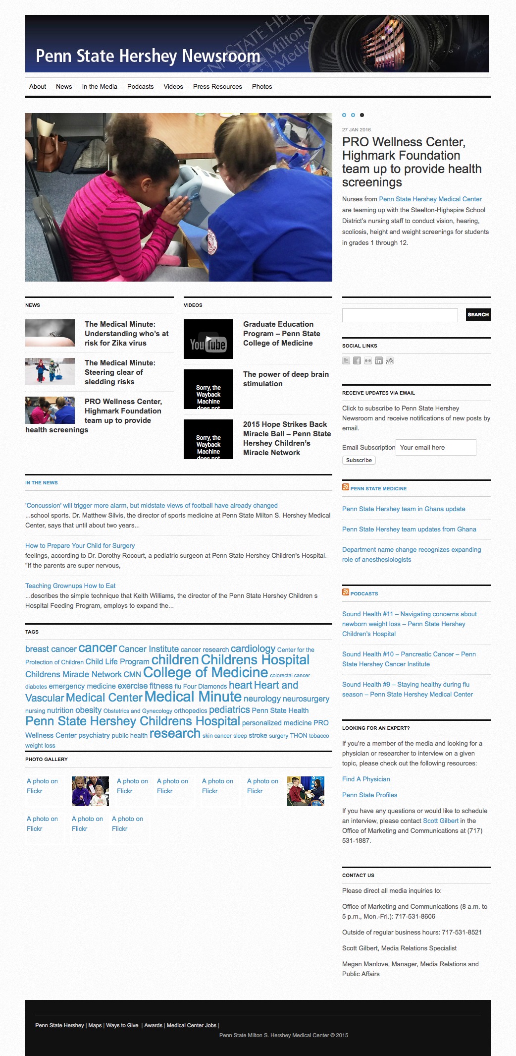
Click the image to view a screenshot of the full page
The old design had some challenges.:
- Lacked any support for mobile
- Missing most features of web accessibility
- Not much room for featured content
- Not much of a hierarchy for content
- Difficulty in discovering content by audience
Some of those are pretty basic things we bake into all the sites we build (responsiveness is a fundamental part of literally every website we do), but the thing we really wanted to focus on for a website devoted to content is discoverability.
Because Penn State Health had such a wide range of content types, they were essentially trying to serve a number of different audiences at once:
- Internal — Employees, staff, etc.
- Patients, potential patients — People with a current or potential direct relationship with the institution with no medical knowledge
- Researchers, potential investors, etc. — People with a current or potential relationship with the institution with advanced medical knowledge
- Public, media — People with no direct relationship with the institution who might find some of the content interesting either because it’s “big news” or it’s a human-interest story (but who have no medical knowledge).
So we asked the Penn State Health team to come up with the categories of stories they felt most reflected the various audiences they were trying to target. Using that list, we tried to make it easy for people looking for a specific category to find new content. We also made the featured content more featured, with a single large image to anchor the page with more featured content less prominent on the side. Inside pages now include links to related stories as well.
Result: In a six-month period after launch, the site saw an increase in pageviews of almost 94 percent (more content being looked at), a more than 55% percent increase in time per session (people finding more relevant content and sticking around), and a 4 percent drop in the bounce rate (not something we were aiming for, but a nice bonus).

Shameless plug
Are you looking to maximize your design?
Is your design helping your content? Is your target audience being exposed to the content that will most interest them? Contact us today to see how we can help!
Contact us for more information