Empathy and Accessibility on the Web
This white paper has been unlocked and is available to all users
Executive Summary
“Web accessibility means that people with disabilities can use the Web.”
– W3C Introduction to Web Accessibility
Web accessibility should mean that people can use the Web.
When you navigate to Google.com on your phone, what you see your on your screen is fundamentally different than what you see if you were to navigate to the same website using your desktop browser. Your phone fundamentally handles information differently than a standard computer, and forcing you to interact with a version of the site that is formatted for a different experience would make it frustrating, if not impossible, for you to use.
Accessibility is the wrong term to be using. What we want to talk about here is “designing websites for humans,” but that’s a little overbroad. So we’re going to use the language of accessibility, but it really applies to everyone.
Accommodations and design decisions regularly cater to different audiences: Smartphone users, tablet users, users with spotty connections, etc. But when it comes to the question of accessibility to those with disabilities, considerations are rarely made without an eye toward impact: How many blind people really are going to use our site? Why would anyone ever need to browse without (or only using) a keyboard?
These are the wrong questions. Especially when you’re talking about higher education; instead of wondering how few people a given change is going to affect, it’s our moral (and legal) duty to do everything we can to make sure our content is available to whomever wants to consume it, however they want to do so. Disability is not a binary: Everyone is somewhere on the scale of disability, and even though you think you’re at the very edge of “not disabled,” that’s a) probably ignoring some things, and b) a factor that could change at any moment.
Details
Defining disability
Disabilities are often thought of in “can’t do [x]” terms: Can’t move legs, can’t see, can’t hear, etc. A common rhetorical example at many sessions on disability is to ask who in the room has visual impairment — you’d be surprised at the number of hands that don’t go up, even among those wearing glasses. Glasses (or contacts) are an everyday accommodation that, since we’ve gotten so used to them, they doesn’t even register as an accommodation anymore. It seems almost as strange as pointing out that most people wear shoes when they go outside to protect their feet — it’s just the way things are.
But that doesn’t change the fact that glasses are an accommodation that, if most people had to do without (myself included), we’d have a much harder time doing things. I probably wouldn’t (or shouldn’t, at any rate) be allowed to drive without them, and would not be able to do my job without sticking my face right up next to the monitor. When it comes to visual impairment, the difference between me and someone who’s legally blind is almost irrelevant in most contexts, except that I have an accommodation that allows me to get along.
Who are we to deny a legally blind person that same ability when it comes to the web?
Thinking about accommodations
When we think of disability accommodations, we often think in very binary, simplistic terms: A handicapped parking space is larger, and supposed to be placed close to a curb cut so a wheelchair can access the sidewalks. A handicapped bathroom should have doors wide enough for a wheelchair, a larger stall with handrails, appliances and dispensers placed low enough to the ground to be used by someone in a wheelchair, and a mirror at either a certain height or slanted downward. In other cases, Braille is featured on signs so that blind people can read them. Crosswalks have verbal as well as visual indicators showing when people can cross the street.
Those are legitimate accommodations that help lots of people. But while they may fill legal requirements/satisfy legal liability, the point is to make things accessible to everyone.
For sake of example, let’s talk about getting into the bathroom.
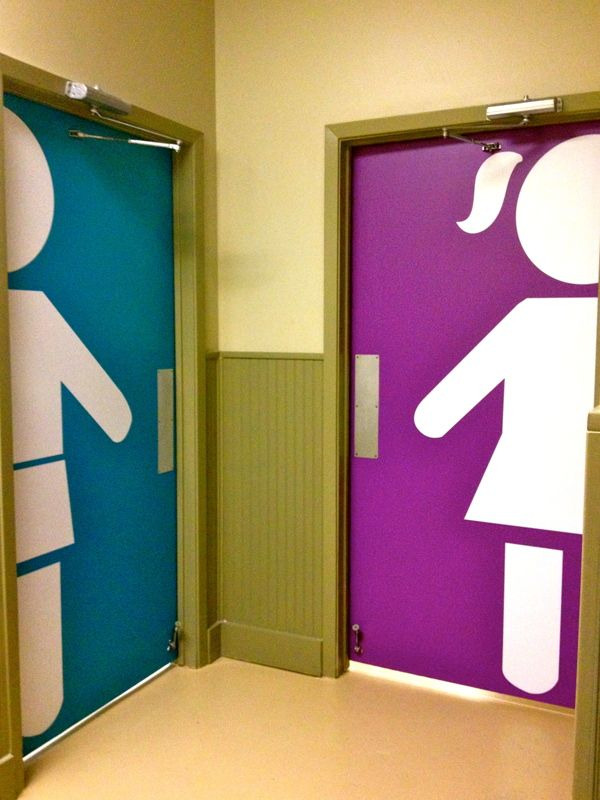
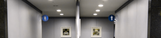
For North Americans without visual impairment, this is an excellent way to indicate which bathroom is which. If you’re from a country that doesn’t recognize blue and pink as primarily gendered colors, this becomes less helpful. If you’re visually impaired, the total lack of tactile indicators (either braille or raised letters) mean you’re at a complete loss to even know whether there’s a bathroom in the direction of the arrows, unless perhaps you could hear flushing.
This one requires some visual acuity if you just need to make out the pictograms, but luckily uses our culture’s gendered coloring system to make it easier to tell which bathroom to use … provided you can see colors.
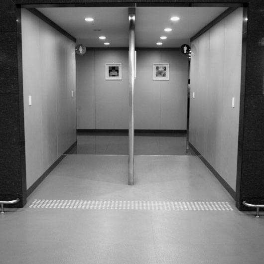
And that’s full color-blindness. Here’s red-blind:
And green-blind:

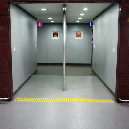
But we need to think beyond even physical disabilities. Absent total blindness, most North Americans would be able to ascertain which bathroom is which with these signs. What about this one, from the World Cup Stadium in Seoul, Korea?
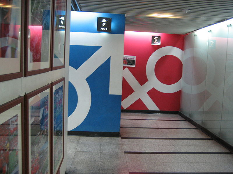 (
(If you didn’t know what the symbols for the different sexes are, good luck! Because the sign above the male restroom definitely looks like the Pizza Hut logo to my eyes.
The cost of accessibility
Using bathrooms as a real-world example done in part to show the glaring flaw in most arguments against accessibility: time and money. Accessibility has a cost, there’s no doubt about it. But it (is/should be) the cost of doing business. People need to be able to use the bathroom; that’s just not a negotiable feature. An, as in cases like the World Cup Stadium, where you would definitely expect to have people of all different countries and cultures coming together in the same place, you need to make sure it’s accessible on every level you can imagine. It costs more money to add signage and there’s an opportunity cost to having fewer, larger stalls (which could require either your customers to wait longer or you to have to use more space for the bathroom).
Being accessible is not optional. It’s just the cost of doing business.
As we go into the requirements and methods of accessibility for the web, please know that we list them with the full knowledge that they constitute a ton of work. But we would encourage you to think of it as work rather than extra work, because these are the things we need to do in order to ensure that everyone can access our content. As those who work in educational institutions, it’s incumbent upon us to make sure that everyone can get the information they need.
Also, the whole “it’s against the law not to” thing. It’s super handy when you’re trying to convince higher-ups of the importance of accessibility.
Legal requirements
When this post was originally written in early 2017, we were responsible for Section 508 accessibility standards, which were published in 2001. As you can imagine, those standards were geared mostly toward technology of the era, with some generality and forward-thinking points thrown in, but fairly basic.
As of Jan. 9, 2017, after two years of the Penguins telling people, “these are the rules now, but they’re almost definitely going to change to this at some point very soon,” the government published the final version of the new rules, which then went effect at the start of 2018. The new rules are basically compliant with the international WCAG 2.0 AA standard.
Pro-tip: There is NO WAY your current websites meets this standard. Just an FYI.
Shameless plug
Not sure where to start with accessibility? The Penguins can help!
Contact us for more informationTips, Recommendations & Takeaways
For direct application, we’ll go with a very high-level overview. These are a few things to keep in mind, accessibility-wise, when designing websites and inputting content that will get you a long way toward accessibility.
Stay away from downloadable documents
Probably the biggest hindrance to accessibility is the ease with which content management systems accept PDFs, Word documents and even PowerPoint presentations. And look, we get it — you design the flyer once, you upload it to the web, and your content works in both places. Look at all the work you saved! The problem with these types of documents are threefold: Most of those documents are not screen-reader friendly; all of these documents are navigational dead-ends, in that once the document is open, it’s very difficult to get back to the page you were on without dedicated knowledge (because, as the content creator, you have no control over whether it opens in a dedicated application, as a new tab in the browser window, replacing your current browser tab, etc.); and none of those documents works very well on devices that are not desktops or laptops.
The device-agnosticism might seem more suited to a mobile-friendliness discussion, but remember that people use all sorts of devices to access your content, for a variety of different reasons. Maybe they only use a tablet, maybe they only use a mobile phone (because in some places/communities, mobile phones are the cheapest and best way to access the internet). Regardless, you can’t assume that the desktop is the only way people are going to access your content, or that everyone has access to Microsoft Word/PowerPoint software licenses.
All content needs to be reducible to text
This sounds very onerous, and it is to an extent: If you have content, be it images, video, audio or whatever, it needs to have a textual equivalent. And note that “equivalent” does not equal “transcript” for any media other than audio, and sometimes not even that. While we know that screenplays of popular movies are available for purchasing, most people would acknowledge that reading the Titanic‘s dialogue is not the same experience as watching Leonardo DiCaprio drown in an icy ocean.
- Old Rose: But now you know there was a man named Jack Dawson, and that he saved me in every way that a person can be saved. I don’t even have a picture of him. He exists now only in my memory.
- Random Voice: Keldysh, Keldysh, Mir 2 on our way to the surface.
- Captain: You know, I was saving this for when I found the diamond. I’m sorry. Three years, I’ve thought of nothing except Titanic, but I never got it. I never let it in.
- Old Rose: Small gasp.
With just the text as your guide, you almost certainly would have missed the part where Old Rose chucks a multi-million dollar diamond off the back of the boat (because why not), right?
For videos, you need to include a transcript along with descriptive text that sets the scene. It’s not enough to just have the words to the Reading Rainbow song, you need to describe the cheesy ’80s rainbow effects and children running through a park. There are services that provide transcriptions — that’s a good start, but you really need to make sure you’re including descriptive text as well.
Similarly, images need to have a lot more than a barebones description (“heart” or “dog” are comment alt texts). Here’s the alt text we used for the last bathroom image above, the World Cup Stadium:
A bathroom entrance in Seoul, South Korea. The men’s bathroom is denoted by the sex symbol for male in white on a blue wall, while farther down the hall is the female sex symbol in white on a reddish wall.
Is that a lot of words? You betcha. A decent bit of work for every image uploaded? Affirmative. But that’s the amount of work required to make sure that everyone who wants to see your content can, in fact, “see” your content.
As a personal aside, we find this freeing. When you put this requirement to the people who want to “create” the content (read: mostly just post stock images), it really allows you find out what they actually think is valuable content versus what they’re trying to throw up just to make things look pretty. If they’re not willing to write a basic sentence describing what the media they want is communicating to the user (or, more likely, can’t do so), it’s pretty easy to then ask why it’s needed in the first place.
Color matters, but color can’t be the only distinguishing characteristic
This section is going to seem slightly contradictory, but the two tenets aren’t opposed: 1) You cannot only use color to distinguish things; 2) Make sure that you distinguish between things of different types. The first part is pretty self-explanatory: We need to make sure that people who cannot see the full spectrum of color can still navigate and use the website. Do you use colors to differentiate between sections or parts of your website? That’s fine, as long as you also use words. If the only difference between the “For Students” and the “For Faculty” sections of your website is that one uses the color blue and the other orange, that’s a problem.
You also need to keep in mind the minimum differentiation between text and the background. Many people like to use brightly colored backgrounds to make words “pop,” but there is in fact a minimum contrast ratio (4.5:1, except large text, which is 3:1) that you have to meet. This is yet another reason why you shouldn’t allow document uploads — printed materials are rarely created using such restrictions, and most don’t bother to change color choices for the web. As for making sure you distinguish between things of different types, think primarily in terms of links. Links need to be distinguishable from the text around them, and it’s helpful to differentiate between visited links and non-visited links. The old “blue for new, purple for visited” style for links has largely gone out of fashion, but there’s an accessibility case to be made for making the distinction. People who have difficulty processing things mentally may find themselves with a large list of links, click on a few, then have no idea which ones they’ve already looked at.
Design is function
Especially with the rules about color, designers often raise their hackles at what they perceive as limitations. They are limitations, but they’re functional, not design.
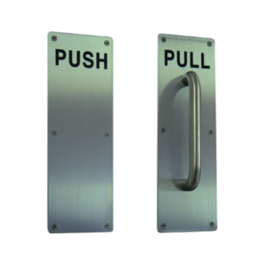
These door handles are pretty standard. One requires you to push, the other to pull. Even if we remove the text, the mechanics required of the user are clear.

But I (and, I imagine, many of you) have encountered situations where the text is necessary, because otherwise the action required of us is unclear.
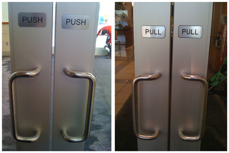
This is an example of a design decision. More to the point, it’s the example of a bad design decision. At some point, when one of the doors was designated push, it was decided that rather than making the door’s appearance match the user’s expectations by removing the pull handle, it was better to add instructions.
Functionality can and should limit designers, because the functionality is always more important than the design. The fanciest car is useless if it does not drive. Since the goal of a website is to impart information to the user, if a portion of the design prevents any segment of users from accessing that information, the design has failed the required functionality. It’s bad design.
Thinking about humans
We heartily recommend reading the Alphabet of Accessibility Issues, which provides 26 different accommodation stories, and doesn’t even start to scratch the surface of all the possible use cases.
Beyond total inaccessibility, though, we must also think how to serve our users by making them comfortable, or at the very least avoiding actively causing them discomfort. This shows up in everything from the front-end UX to back-end databases, and everything in between.
Forms that ask for information about you typically include a first and last name field, and both are often required. But not everyone has both a first and a last name.
In the United States, there are (at least) thousands of people named FNU, with the last name LNU, or whose visas read “No Name Given [Surname].” As the last example implies, these are not family names or common first names from a foreign country: They are acronyms (First Name Unknown and Last Name Unknown) that are given to people at various stages of the immigration process.
In some countries, passports are printed with two names as the “Given Name,” and no surname. In the US, when a visa is issued, if there is no surname in the passport, the “given name” becomes the surname, and the first name becomes First Name Unknown, or FNU. This may seem like a minor bureaucratic headache, but thanks to I-9 compliance (the forms you use to prove you can legally work in the U.S.) that has now become your official name. Your name on your ID badge and in the university directory is “Fnu,” so your mail comes addressed to “Fnu,” and suddenly you have a new first name courtesy of the United States Citizenship and Immigration Services.
These aren’t the only headaches. Technical Penguins co-founder Kaitlyn’s mother had similar anxiety when booking a flight recently. She was born Jo Anne, but changed her name to JoAnne (no middle name) more than 30 years ago. When she got her boarding pass, she was anxious to learn that it was issued to Joanne [LAST NAME], and she was worried that since it didn’t match her given name on her driver’s license (which has the “A” capitalized), she would get in trouble. We convinced her it was nothing to worry about, but we definitely have the capability to store the capitalization of letters. Why on earth not reflect that?
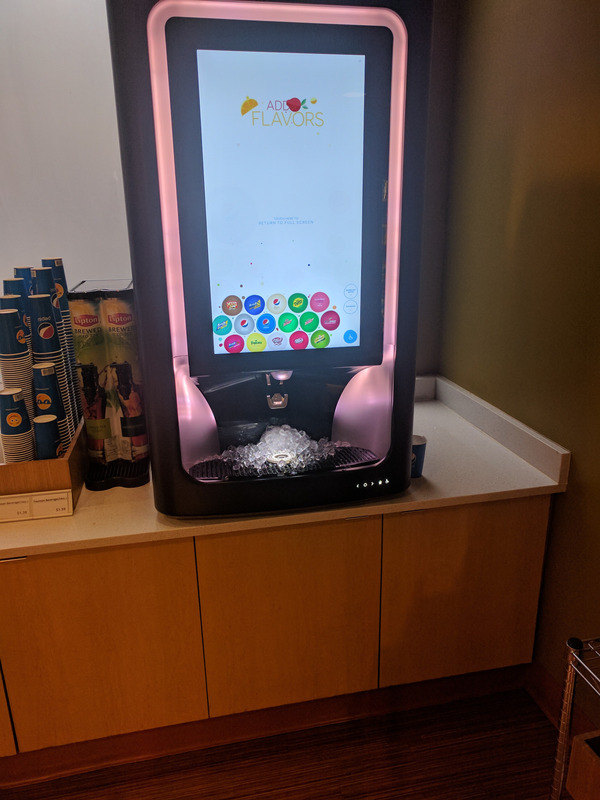
Our favorite example comes from our full-time job’s cafeteria. We have one of those new-fangled touchscreen soda dispensers, where there’s one nozzle for the drink to come out and you have to touch all your options on the screen (“I want a Sierra Mist with a spritz of peppermint,” said no one ever) to get your personalized drink.
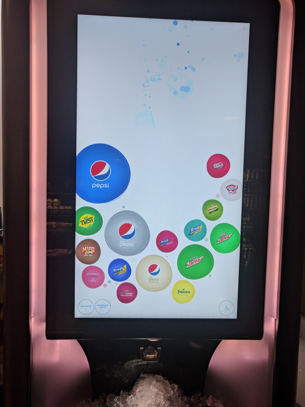
Typically, the buttons on the screen are arranged in a gentle curve along the left and bottom of the screen, with some options more than four times the size of others. When we walked past it one day as we were preparing this talk, however, we noticed that there was a small accessibility button in the lower corner. When hit, the icons rearrange themselves to be the same size as each, lined up in rows along the bottom of the screen.
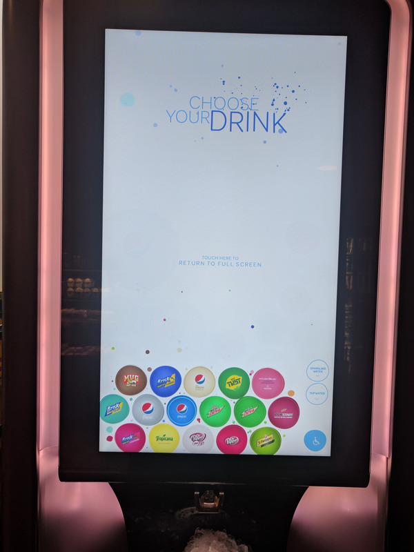
This is actually a really neat feature! There clearly was thought put into the design of the machine so that people who might not be able to reach the buttons in their original arrangement would be able to access all of them. And it would work great if the whole machine wasn’t three feet off the ground, on top of a counter that has no space for, say, a wheelchair to slide under it to allow someone in the wheelchair easy access to the nozzle.
It’s not enough to have good ideas and good execution. Implementation, vigilance and feedback are essential to enable and maintain accessibility.
Big Takeaway
If you take nothing else away from this post, we would advise this: Websites should be as easy as possible to use for as many as people as possible. Everything we do should work toward that goal.
If you’re not a developer, you can still help. The biggest things that people can do are talk about the importance of accessibility, make sure accessibility is baked into the plan as early as possible, read and understand the standards (most people will tell you specific implementation X is not required when, again, laws and stuff) and, above all, have empathy.
All images in this post are being used in conjunction with making a contribution to a field of knowledge. We do not claim any rights to them.
Read more
Get more great advice
Technical Penguins is a full-service digital shop. We offer content, development, design and other internet services. Have a project you’re thinking about pursuing, but need a little help? Get in touch!
If you’d like to read all of our white papers (including tips and recommendations), you can either join with a content membership plan or purchase a maintenance agreement, which includes access to all content! Maintenance agreements also include discounts on all services, as well as other perks.
Standard WordPress Maintenance Plan
- We'll keep WordPress and your plugins up-to-date on a monthly basis.
- We will ensure your site is being comprehensively backed up monthly.
- Includes access to all our white papers, with members-only recommendations and tips.
$40/month
Find Out More
Premium WordPress Maintenance and Security Plan
- We'll keep WordPress and your plugins up-to-date on a monthly basis.
- We will ensure your site is being comprehensively backed up monthly.
- Full access to and use of the Penguin Pack, a smorgasbord of services and add-ons that can enhance your website. Features include image optimization, security, SEO, newsletter opt-in forms, even selling courses! This can replace some existing services or plugins you already use, and we'll get everything set up for you.*
- Includes access to all our white papers, with members-only recommendations and tips.
- 10% discount off regular hourly rates for scheduled work performed.
$75/month
Find Out More
Penguin Pro WordPress Maintenance and Security Plan
- We'll keep WordPress and your plugins up-to-date on a monthly basis.
- We will ensure your site is being comprehensively backed up monthly.
- Full access to and use of the Penguin Pack, a smorgasbord of services and add-ons that can enhance your website. Features include image optimization, security, SEO, newsletter opt-in forms, even selling courses! This can replace some existing services or plugins you already use, and we'll get everything set up for you.*
- 1 hour of work included every month
- Includes access to all our white papers, with members-only recommendations and tips.
- 15% discount off regular hourly rates for scheduled work performed.
$120/month
Find Out More* Free setup only includes the setup of the new tools and services. If you need to migrate information from an existing tool or service (e.g., from a different membership plugin/program), that would incur an additional cost for the work at our (discounted!) hourly rate.